Start check your responsive design online. Adapt with other device width. See your site with laptop or computer is great. But, have you ever tried it on other device ?. Resize it manually with Media Queries, and try open your site with other device. Fortunately, some great tools can do that easily. Just type your site URL and your responsive designs result displayed.
Why ?
If you new to responsive design, you would feel confused. How to do that ? The goal you do is build one site that adapts with other device. Simple but difficult.
To do this work, of course you need to see the difference for other device widths.
Responsinator is one of the easiest way to get a quick look. Fast, simple, and powerful. Responsinator now serve 12 different devices. Join now, its free. Type your site URL to get started. And automatically display the result. Portrait and landscape included here. So, what are you looking for.
Screen Queries offers super details responsive design checker. All device is based pixel. Great for senior. Not just that Screen Queries have more than 20 different devices. Reload button help you refresh your responsive result quickly and start with new result. You could resize the width until 2550px, WOW, Amazing.

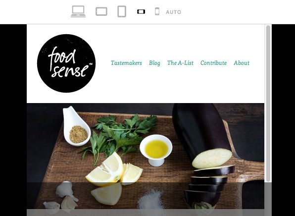
The next tool on the list is Responsive.is. The concept here is the same as before, the site provides a quick way to view your layout at multiple different widths. However, the approach is drastically different. For starters, there aren’t any device silhouettes. There’s a small toolbar at the top of the screen but the rest is reserved for a single site preview that changes according to your selected device. This is a bit more convenient as it eliminates the seemingly endless scrolling as well as the loading of multiple previews, but some of the obviousness of what’s going on is lost in the process. The minimal interface is really nice though, something I appreciated after spending a lot of time with the bulky silhouettes of The Responsinator.
Responsive.is actually comes with a menu that contains built-in responsive sites to test drive so you can get a feel for how the service works (I used Food Sense). If you want to test another site, simply enter it into the box.
