Label:
Apps,
Responsive,
Tools
3 free apps for testing responsive designs
Start check your responsive design online. Adapt with other device width. See your site with laptop or computer is great. But, have you ever tried it on other device ?. Resize it manually with

Responsinator is one of the easiest way to get a quick look. Fast, simple, and powerful. Responsinator now serve 12 different devices. Join now, its free. Type your site URL to get started. And automatically display the result. Portrait and landscape included here. So, what are you looking for.

Screen Queries offers super details responsive design checker. All device is based pixel. Great for senior. Not just that Screen Queries have more than 20 different devices. Reload button help you refresh your responsive result quickly and start with new result. You could resize the width until 2550px, WOW, Amazing.
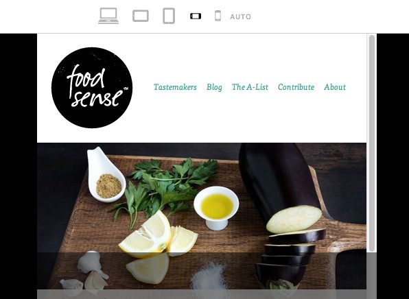
The next tool on the list is Responsive.is. The concept here is the same as before, the site provides a quick way to view your layout at multiple different widths. However, the approach is drastically different. For starters, there aren’t any device silhouettes. There’s a small toolbar at the top of the screen but the rest is reserved for a single site preview that changes according to your selected device. This is a bit more convenient as it eliminates the seemingly endless scrolling as well as the loading of multiple previews, but some of the obviousness of what’s going on is lost in the process. The minimal interface is really nice though, something I appreciated after spending a lot of time with the bulky silhouettes of The Responsinator.
Responsive.is actually comes with a menu that contains built-in responsive sites to test drive so you can get a feel for how the service works (I used Food Sense). If you want to test another site, simply enter it into the box.
Media Queries, and try open your site with other device. Fortunately, some great tools can do that easily. Just type your site URL and your responsive designs result displayed.Why ?
If you new to responsive design, you would feel confused. How to do that ? The goal you do is build one site that adapts with other device. Simple but difficult.
To do this work, of course you need to see the difference for other device widths.
Responsinator

Screen Queries
Responsive.is
Label:
Font
WOFF, TTF Or OTF Font Format ?
This blog rich with fonts. 10 kinds of fonts stand here. But, are you ever think "Which one i choose WOFF, TTF, or OTF Font Format ?" That is what in my mind now.
Let me help you choose the right font format for your blog or website.
2. OTF ( Open Type Font ). According to caniuse.com. TTF and OTF Font Format is same. But see this short description
Let me help you choose the right font format for your blog or website.
- TTF ( True Type Font ). TTF is most common format. It working on Mac OS and Microsoft Windows OS. The primary strength of TrueType was originally that it offered font developers a high degree of control over precisely how their fonts are displayed, right down to particular pixels, at various font sizes. With widely varying rendering technologies in use today, pixel-level control is no longer certain in a TrueType font. How About browser support.
- Safari = 3.1 >
- Chrome = 4.0 >
- IE = 9.0 > ( Partially Supported )
- Opera = 10.0 >
2. OTF ( Open Type Font ). According to caniuse.com. TTF and OTF Font Format is same. But see this short description
TTF and OTF are extensions that are used to indicate that the file is a font, which can be used in formatting the documents for printing. TTF stands for TrueType Font, a relatively older font, while OTF stands for OpenType Font, which was based in part on the TrueType standard.3. WOFF. WOFF is a powerful font format. WOFF font format is compatible with All major browser. I use WOFF font format too. Not Just that, This font format is SEO, better typography for the web. So i recommend you to try this format.
A significant difference between the two is in their capabilities. TTF depends solely on glyph tables that define how each character looks while OTF is able to use glyphs along with CCF (Compact Font Format) tables. The cubic Bezier splines used by CCF allow for fewer points to be used in defining how a character would look compared to the quadratic Bezier splines used by TTF fonts. OTF also adds a few smartfont features, on top of the sfnt structure that is being used by TTF, to add additional language support to the fonts. Although it may not have a very significant effect on your computer, it is also worthy to note that the use of CCF in OTF could lead to file sizes that are significantly smaller, given that no special features are used in the font.
Despite the proven superiority of OTF fonts, especially when using CCF, the use of TTF fonts is still very prolific. It may be taking much longer than expected, but the number of OTF fonts is already on the rise. The reason behind this popularity is the simplicity of making TTF fonts compared to OTF fonts that use CCF. Since there is really no reason to stop using TTF in creating new fonts, most font makers still stick to what they know works, even if it is inferior to the alternative.
There is really no issue for the end user as almost all modern applications that uses fonts are able to work with TTF and OTF files. Users don’t need to choose one over the other as they can be used together in creating documents or printing layouts. Summary:
1. TTF is the file extension for TrueType fonts while OTF is the extension for OpenType fonts.
2. TTF fonts depends solely on a glyph table while OTF fonts can either have glyph tables or CCF
3. TTF font files are often much bigger compared to OTF font files
4. TTF fonts are still so much more popular than OTF fonts
5. TTF fonts are much easier to make compared to OTF fonts
Conclusion
Gentle with the font. Choose high quality free font. Found it on Google Web Fonts, Font Squirrel.
Label:
Animation,
CSS

This great tutorial, pure CSS Animated Progress Bar. Someone use Progress Bar for any reasons. In business world Progress Bar is useful, look like 4Shared. Some CSS very helpful here Keyframes animation and animation. This CSS progress bar very easy to customize. You can change the speed, background, or the bar. Codepen help me to build this project. Let's Start
CSS Animated Progress Bar
This great tutorial, pure CSS Animated Progress Bar. Someone use Progress Bar for any reasons. In business world Progress Bar is useful, look like 4Shared. Some CSS very helpful here Keyframes animation and animation. This CSS progress bar very easy to customize. You can change the speed, background, or the bar. Codepen help me to build this project. Let's Start
HTML
Single elements!<div class="progress"><div>
CSS
Somekeyframes it become animated.
.progress {
background-color: #1a1a1a;
	height: 25px;
	padding: 5px;
	width: 350px;
	margin: 50px 0;
	-moz-border-radius: 5px;
	-webkit-border-radius: 5px;
	border-radius: 5px;
	-moz-box-shadow: 0 1px 5px #000 inset, 0 1px 0 #444;
	-webkit-box-shadow: 0 1px 5px #000 inset, 0 1px 0 #444;
	box-shadow: 0 1px 5px #000 inset, 0 1px 0 #444;
}

.progress div {
          display:block;
          background-color: #34c2e3;
	  background-image: -webkit-gradient(linear, left top, left bottom, from(#34c2e3), to(#3cbef2));
	  background-image: -webkit-linear-gradient(top, #34c2e3, #3cbef2);
	  background-image: -moz-linear-gradient(top, #34c2e3, #3cbef2);
	  background-image: -ms-linear-gradient(top, #34c2e3, #3cbef2);
	  background-image: -o-linear-gradient(top, #34c2e3, #3cbef2);
	  background-image: linear-gradient(top, #34c2e3, #3cbef2);
	 height: 100%;
         width: 100%;
	-moz-border-radius: 3px;
	-webkit-border-radius: 3px;
	border-radius: 3px;
	-moz-box-shadow: 0 1px 0 rgba(255, 255, 255, .5) inset;
	-webkit-box-shadow: 0 1px 0 rgba(255, 255, 255, .5) inset;
	box-shadow: 0 1px 0 rgba(255, 255, 255, .5) inset;
        -webkit-animation:progressbar 15s linear;
        -moz-animation:progressbar 15s linear;
        -ms-animation:progressbar 15s linear;
        -o-animation:progressbar 15s linear;
        animation:progressbar 15s linear;
}
@-webkit-keyframes progressbar {
0% {width:0%;background-position:top left;}
100% {width:100%;background-position:bottom right;}
}

@-webkit-keyframes complete {
0% {visibility:hidden;}
1%, 100% {height:1000px;visibility:visible;}
}

@-moz-keyframes progressbar {
0% {width:0%;background-position:top left;}
100% {width:100%;background-position:bottom right;}
}

@-moz-keyframes complete {
0% {visibility:hidden;}
1%, 100% {height:1000px;visibility:visible;}
}

@-ms-keyframes progressbar {
0% {width:0%;background-position:top left;}
100% {width:100%;background-position:bottom right;}
}

@-ms-keyframes complete {
0% {visibility:hidden;}
1%, 100% {height:1000px;visibility:visible;}
}

@-o-keyframes progressbar {
0% {width:0%;background-position:top left;}
100% {width:100%;background-position:bottom right;}
}

@-o-keyframes complete {
0% {visibility:hidden;}
1%, 100% {height:1000px;visibility:visible;}
}


@keyframes progressbar {
0% {width:0%;background-position:top left;}
100% {width:100%;background-position:bottom right;}
}

@keyframes complete {
0% {visibility:hidden;}
1%, 100% {height:1000px;visibility:visible;}
}
OK, Enjoy
I hope you like it.
Label:
CSS3

Responsive Design are great, but it is not easy to do. Horizontal Scroll always attack your responsive project. How to remove it ?
1. Add
2. Using
Media Queries Horizontal Scroll Issue
Responsive Design are great, but it is not easy to do. Horizontal Scroll always attack your responsive project. How to remove it ?
1. Add
max-width property. Why ? max-width help limit the width.
  @media screen and (max-width: 960px) {
body {
...
max-width: 970px;
}
2. Using
overflow-x property. overflow-x help hide all elements outside the specified width. More about overflow
  @media screen and (max-width: 960px) {
body {
...
overflow-x: hidden;
}
You Step On The Finish Line
One most important things in Responsive Web Design work. Try put the code in yourbody. If it work, i hope you like it
Langganan:
Postingan (Atom)